Thursday, December 27, 2007

Inspiration from a pillow


Hi y'all!


Teri here.


Been in a little bit of a funk lately so I found a little card making inspiration over the weekend, thanks to a pillow rescued from a 90 percent off clearance rack! ;)

Both of the two cards you see here are a result of the pillow behind the cards.


I pulled color inspiration for both cards from the pillow. I was totally drawn to the pillow's lovely combo of white, green and blue combo.


I was also a bit inspired by the overall clean feel of the design of the pillow so I tried to incorporate a little of that feel into my cards.

I think my cards turned alright. I think I definitely spend a little more time checking out clearance racks for card making inspiration!


-teri


Love the look of stamped images...but hate the mess!?!!? LOL


I, myself, LOVE the look of stamped images... I love stamps themselves...I just don't like having to pull out the stamps and stamp pads or paints...and I definitely don't like having to clean up when I'm done! HA HA!

I know... I'll admit I'm a bit lazy when it comes to my papercrafting... I like to keep things somewhat simple...easy...and quick. :)

That's why I LOVE some of the wonderful rub-on images that are available out there these days. They look just like stamped images!

I created this birthday card using new BoBunny papers and rub-ons!

I simply transferred the rub-on flower image and the sentiment to white cardstock.

Then, just as if it were a stamped image, I "dressed it up" a bit by adding some jewels and some ribbon.

QUICK....EASY... AND NO MESS!

CHALLENGE!!! Post here and share a link to a project YOU create using Rub-ons in the place of a stamped image! I'll randomly pick one name and post the name here on January 4th. Check back to see if you won and I'll send you a couple sheets of BoBunny rub-ons for your very own!


Dee ;)


Wednesday, December 26, 2007

Making ART with patterned papers!!

Hey there, Natalie here.

If you’re anything like me, you can't get enough of BasicGrey papers. I love their style, I love their color combinations, and I love the ability to mix papers from different lines and still have combinations that look great.

One thing I like best about BG is they have a sophisticated style that I relate to. Even their Pheobe line, which is playful has a sophistication I love. I’ve been thinking for quite some time about how I’d like to have some BG style home décor. I slightly satisfied this urge by covering some light switch plates with paper. I Mod-Podged the paper on and gave it three top coats of Mod-Podge for good coverage. (sanding the plastic cover first gave it a key to adhere to).


Light switch projects aside, I’ve been wanting some more things to hang on the walls. I’m really into retro designs and graphic shapes, and I’ve been thinking of making something from BG paper for a nice piece of art. So….

I started with this picture and frame I bought at a yard sale for a dollar. I bought it thinking I could give the frame a nice make-over, and maybe do a painting over this old one. Which I think is actually a textured print. (old crap, whatever I call it) The photo was taken with a flash, hence the slight shine, but ya, it was already this strange color of washed-out yuk.

I started by removing the canvas from the frame and painting the canvas white.

I then got 5 coordinating BG papers (from different lines) and I cut out a bunch of circles and rings with kitchen bowls and the Coluzzle large nested circle template. As you probably already know, the Coluzzle large nested circles aren’t very big, so I had to use bowls too. I got out the small circle template, but didn’t end up using any small circles.

I used Color Box Fluid Chalk ink by Clearsnap, and inked around the edges of each circle. I used Creamy Brown, Chestnut Roan, and Amber Clay. I must add right here, that part of why I think this was so successful is the inking of the edges. It helps the eye see a finished edge on each paper, and it removes the white core of the paper, which isn’t attractive.

I sat and arranged and re-arranged my circles and rings until I had a design I liked. A big part in liking the design was making sure the gaps between the circles were even. I didn’t want a large gap in one area, and a tiny gap in another. With the arrangement of circles satisfactory and covering the perimeter of the canvas, I started in one corner and used my squeeze and roll glue pen to attach each circle together where they overlapped. Once every circle was connected to its overlapping neighbor, I turned the whole piece over.

On the back side, I attached scraps of black cardstock over each gap. Once all holes were covered, I turned it back over to the front, trimmed off any overhanging edges of circles so that my creation fit the edges of my canvas exactly.

I then glued down my paper creation to the canvas. I would not recommend using a liquid adhesive like Mod-Podge. It’s too wet, dries too fast, and there’s too much chance of it getting on the front with my talents of having a brush flip out of my fingers and land where I don’t want it to. So I used my squeeze and roll glue pen. I wasn’t expecting it to adhere, but I thought I’d try it before I used a spray adhesive. And it worked, so I didn’t have to use a stinky spray adhesive.

I didn’t want a sheen on my finish, and even matte Mod-Podge has a slight sheen, so I didn’t put a coating of anything on the finished side. I suppose, if I was concerned with people touching it (i.e. children) then I would use a matte spray finish to protect it. Those are invisible and are great!

Since the room I was hanging it in is used by my husband, I asked him if I should paint the frame black and make it look nice. He said he liked the old frame, gap in the corner and all, so I left it as it was and hung it up!


This project was so fun, I made another one to match my bedroom, about 4 times the size of the first one. Although I’m pleased with the finished result, my advice for a big one is: --Stick to large circles. I struggled to get spacing I liked with the small circles, but I’d already cut them out, so I had to use them.I attached this one over a piece of interior door that I had. (long story)
I covered it with green fabric and then attached my paper creation.


And just for the record, DH has been happy for me to put accents of pink and green in our brown, tan, and white bedroom. I was really unsure what he'd say with this much pink and green, but he liked it. So yea for me!!

One of a kind!! (for now)

Sunday, December 23, 2007

Dimension. I just love it- don't you?

So this layout has alot of it, but I never was the great photographer of layouts. I tried. Anyway. I just love page frames, because you can add lots of bulk, then put it in a frame, and add some more! The problem with most of the 12 x 12 frames I have run across is they do not hold anything bulky. But these babys do! You could probably put a baby t shirt in it on a page, and it would work well. :D


This is my Great Neice, just after she was born. The Heart at the bottom right is a page frame also, and it holds her date of birth. Then the whole layout is slipped into the 12 x 12 page frame, and I added rubons and another page frame -- the star. Ribbon thread through the top for hanging, or you can just hang it on a nail.


I have some frames in Christmas tree shapes, I am not sure if I wan't to do an acrylic album with them, or use them on a regular layout. Just love this stuff!


Anyway, just wanted you to see how much dimension you can add using these, I just heart them!!


Gotta go wrap some presents-- Have a wonderful Christmas Everyone!! ~~Shellie


Thursday, December 20, 2007

Outta This Funk with your SCRAPS and SKETCHES!


It's me---Miss Melissa posting today! SO happy to be here with my friends and mentors.


I wanted to share 2 of my most favorite---in-a-funk cures.


The first is my SCRAPS---I save them all---and sometimes all it takes, is noticing how they have fallen together, mismatched, shaped, trimmed, torn, and used. It's so much easier for me to be inspired by small bits of paper, than by the whole sheet. Plus, I feel a bit more daring with my paper and patterns when they are in bits, versus cutting away at a new sheet.
The next place I turn when I'm not feeling too creative is to a sketch. I'm always amazed at how these help me try new things and inspire me to a whole new level. Here are a couple of my favorite card sketch sites:
http://www.cardpositioningsystems.blogspot.com/
I'd love to know what your favorite sketch sites are too---I'll be sure to bookmark them!
And, above just a couple of cards I made using a sketch and my beloved scraps!
Melissa

Monday, December 17, 2007

Photos That Inspire!

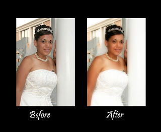
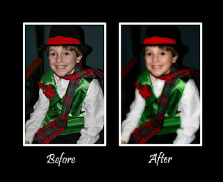
Hi everyone! When I'm in a funk I usually turn to my photos (which happen to be on my computer). I love to just go through them all because I know I'll take a lovely stroll down memory lane and I usually end up laughing or crying and I always walk away with some photos that I just have to scrap. After I find my photos I will then think about the journaling and either type it out in MS Word, or just hold off a bit and start my layout. However, sometimes my favorite photos are really not that great. Unfortunately bad photos are something we all have but that certainly doesn't mean we can't scrap them! Photoshop is so awesome for fixing up bad photos and when you have a photo that is just so terrible you can't fix it, you can alter it completely, making it blurry purposely, or making it black and white with some texture, printing on cardstock, and so on. When you do come across a photo that is not that bad, but not all that great either, there is help. A conversion referred to as the Orton Technique is becoming very popular. Some photos tend to be very harsh. For example, I love my mom and dad dearly but when I take up close shots of them their aging shows a bit too much sometimes (especially when the flash is used!) This technique helps with that by creating a softer look to the overall image. If your photo is a little blurry, this technique works great. It also works well on images that have a lot of white in them, wedding photos for example work very well. The Orton technique was developed by a man named Michael Orton. Basically he merged two images together, one sharp and one out of focus (same image) to create a beautiful, soft looking image. Here are some samples so you can see the difference;


Orton Technique Instructions for Photoshop (all versions)

1. Open your photo and make any adjustments to it so that is looks it’s best (levels, unsharp mask, etc.)

2. Now you will need to duplicate your image by creating a new layer. You can do so by using the short cut keys “Control J” or by putting your cursor on the background layer and right clicking and then click on “duplicate layer”. Name this layer “Sharp”.

3. Now just repeat those steps once again, making another layer by either right clicking and selecting “duplicate layer” or by just using the short cut keys “control J”, this will give you a new layer named “Sharp copy”.

4. Click on the “Sharp copy” layer and change the blending mode to “screen”. (The blending mode is usually on normal and it has a pull down menu.)
5. With the “Sharp copy” layer selected right click and select the “merge down” option.
Now click on the “Sharp” layer and duplicate it. Name this layer “out of focus”.
6. With the “out of focus” layer selected, use the filter menu and click on “blur” then click on “Gaussian blur”. The amount of blur depends on your photo resolution, basically you want the detail gone but the shapes in the photo to remain. A number between 15-20 usually works well. If you have six megapixel camera go with 15, if you have an eight mp camera try 17, if you have anything higher use 20.

7. Now change the blending mode of the “out of focus” layer to “multiply”.

That’s it, now just flatten your image (click on the top pull down menu “layer” and then click “flatten image”.
So next time you are in a funk, check out your photos, I'm sure there are a few (even if they are not perfect!) that you are just dying to scrap! If you have any questions please post them and I will answer and try to help out if I can! Happy Designing!
Wendy

Saturday, December 15, 2007

Get outta your funk by creating something for someone else!


I have to say that mojo steps out on me FAR more than I wish she/he would? (Is mojo a he or a she? I've never figured that one out).

Anyhow, one of the biggest mojo replenishers for me is to put aside whatever it is that I may be working on for myself or for an assignment and to create something for someone dear to me.

I am not sure if I am far too much of a perfectionist when it comes to "work" and it sends mojo high tailing it outta my life or what my issues tend to be, all I know is I find true satisfaction and enjoyment in creating for someone else as the mere thought of how the recipient of one of my projects will be affected keeps a smile on my face. Once I sit down to create for someone else, I find that mojo winking at me from the door of my scrappy room and soon enough she/he is joining me in full swing.

This lil' number is a mini album that I made for my dear friend Alison that lives in Dublin. I wanted to create a little book for her to drop photos from the year into....sort of a "2007 at a glance" sort of thing. I hope she likes it!

I also have to say that any time I immerse myself in product by We R Memory Keepers that mojo seems to pep right up! The "Foil, Glitter, Flock" rubons that I used on the cover DEFINITELY perked mojo up! You should have seen me squealing like a girl telling her friends about her first kiss, when I was trying these out for my first time. DEFINITELY fun and mojo replinishing! In fact, keep posted, because I'll probably make a demo video showing how to use them soon!

So my advice for the day is if you find yourself in a funk....think of someone else! It works for me!

~ Kristy

Mojo on your feet

Hey girls, (guys too if you're there)
Natalie here.
Since we have so many great scrappers on this inspirational team, I'm going to try and be the voice of inspiration for your home. Since I love scrapbooking you will occationally see the two incorporated in posts from me, but more often I'm going to share ideas to help you find inspiration for decorating things in your home. I've always got more projects going on than is healthy for one person.

I'm forever trying to think of ways to make my surroundings more beautiful, more fun, more comfortable. Little ideas and big ones; like the holes I put in my wall on purpose. (I'll show you that one soon.)

Nothing brightens my day more than a project that I can accomplish in a few hours, and then sit and enjoy for ages!

I've got so many ideas to get you... out-of-a Funk.

I'm looking forward to it!! ~Nat

Anything Goes

Whenever I find myself in a scrapping funk, I like to just let myself go and have a little fun. I'll try something new and just go with the flow. I keep reminding myself that whatever I create is fine and there are no rules that I have to worry about. With no guidelines to follow, I find it easy to get those creative thoughts flowing again. I made this travel journal over a year ago and had set it aside and never made any entries in it. Last time I was in a creative slump I got it out and just started adding my journaling. After I finished my entry, I pulled out some stickers and stamps and just started having fun with them. Once I got started, the ideas just started to flow and before I knew it I had finished a couple of pages. This is the first page that I finished...but there's more to come...if you're interested!


Jen N

Quick Cure...it's all about the senses!!

Hi everyone!
Welcome to 'Outta This Funk' where our goal will be to help you get outta your funk. I know we all find ourselves in a funk at one time or another...and we hope that this is the place where you'll be able to get your mojo back!

I wanted to post a QUICK CURE!

When my mojo has disappeared... and Funk has moved in... I try to get my creative juices flowing again with the help of my SENSES!

1. SOUND: Turn on some of your favorite music! (Right now, it's Christmas Music, but Harry Potter Soundtracks always get me in the mood, too!)

2. SMELL: Light a candle in your scrap space.... something light and cheery and delicious! Or a little burst of air freshener...maybe some potpourri. How about a few cinnamon sticks nearby!

3. TOUCH: Take a few minutes to straighten up your work station...or go through a couple of drawers or bins...reorganize some supplies...just get back in touch with your goodies!!

4. TASTE: Yes...this is very important, too... a nice cup of French Vanilla coffee works well...or maybe a delcious Orange Spice Tea... Chocolate works great, too! Keep a little basket of candy on your work station for when you need to open up the senses!

5. SIGHT: Come to this blog and check out the inspirational projects posted by the Inspirational Team...or...look through an old magazine...or surf the net for some inspiration...it's everywhere!

OK...now that you have all 5 senses working... your mind should be ready to create!! Try it!

Post a comment here and let me know what YOUR favorite scrapbooking SOUND is... what sort of music do you like to listen to that helps get YOUR creative juices dancing!

Dee ;)

Friday, December 14, 2007

Welcome!!

Hi there!!! We are all SO terribly excited about this blog and have so many exciting things to come. So we hope that you will continue to check back regularly.

The inspirational team (as you can see from the side bar to the right) is chalked full of incredibly talented ladies.


To start our adventure off I wanted to share an album with you that I've been working on this month.


How many of you just hate to scrapbook those Christmas/Holiday photos?? Anyone? I'm sure that there's a bunch of you out there answering me with a loud "YES!!!". I know I'm one of them!! LOL!


Every year it's the same thing. I take the same kinds of pictures and they all turn out the same way. It's just boring & blah to me.


So this year, after being inspired by Ali Edwards and her fabulous album (December Daily) I decided to make one of my own. I was even a few days late in getting the thing started.


I'm doing mine in a simliar fashion as Ali has done hers. I'm using an acrylic album (7" x 6') and using a lot of Hambly overlays, rub-ons, number stickers (from a variety of manufacturers - a great way to use up those numbers!), some Prima & Heidi Swapp bling, and the new & yummy Scenic Route Roxbury christmas collection. I'm sure that the Scenic Route alone has given me much of my inspiration because I just love it!


This album is a daily account of each day in the month of November. It's a great idea when you're starting it to plan ahead. Make the base of each page and leave room for adding photos and journaling. This idea of working ahead makes it so much easier to just fill in the days' information later on at night when the kiddos have gone to bed or you when you have time to relax.


I am just having so much fun doing this album. It is really helping me to enjoy scrapping my Christmas & holiday photos. I'm just so excited about it and it makes me want to show everyone what I've been up to. So I want to encourage you to try something like this. You could even do the 12 Days of Christmas. (yes, I know we'd be a couple of days behind ... but you can catch up quite quickly. Trust me. That's what I did! LOL!)


So here's the cover of my album.
Back of cover & 1st page
Day 3
Day 5

Day 7

Day 9

Day 11

You can follow along as I continue this fun album by checking out my blog. Me & My Thoughts.

Well, I hope that this album inspires you to create and scrap those special memories that you capture this holiday season (even if you don't like those pictures you should give this a try!! I guarantee that you will be one happy scrapper!)

Have a great weekend!
Cari